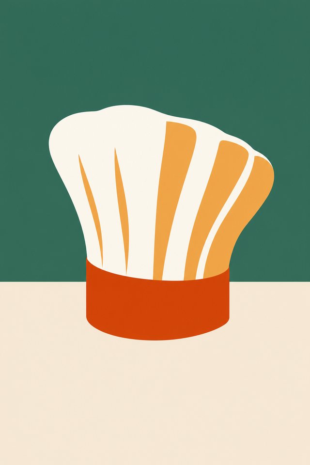
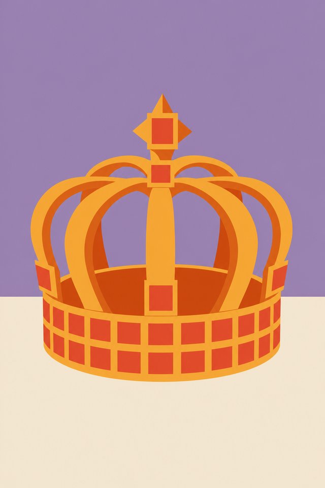
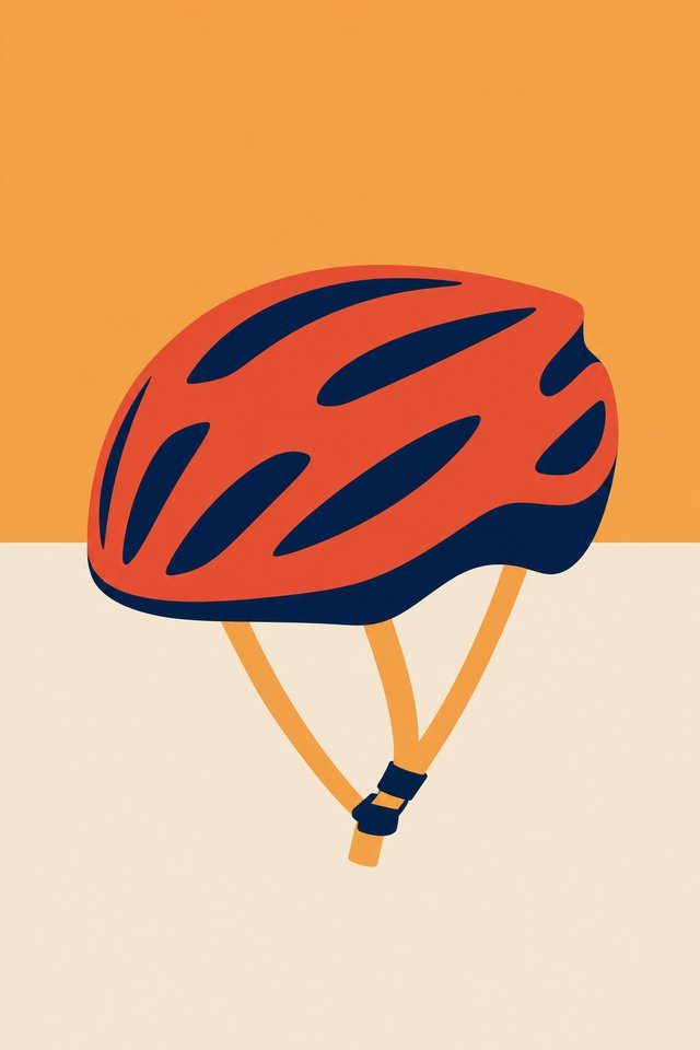
Flat colours 1st, 25 picks
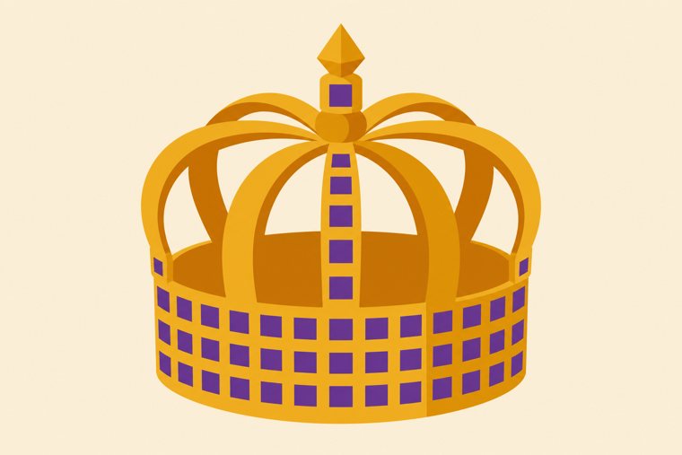
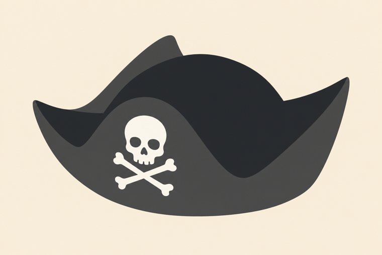
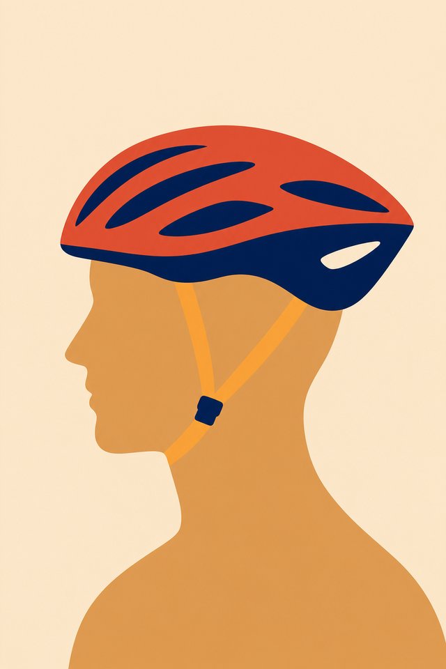
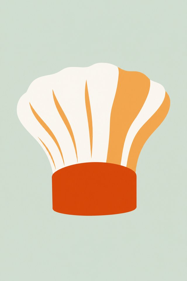
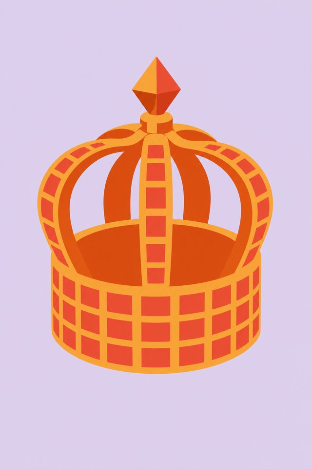
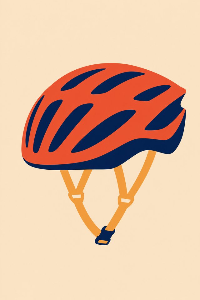
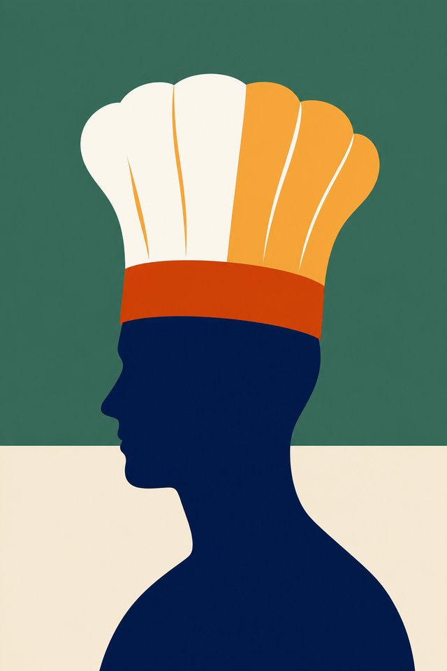
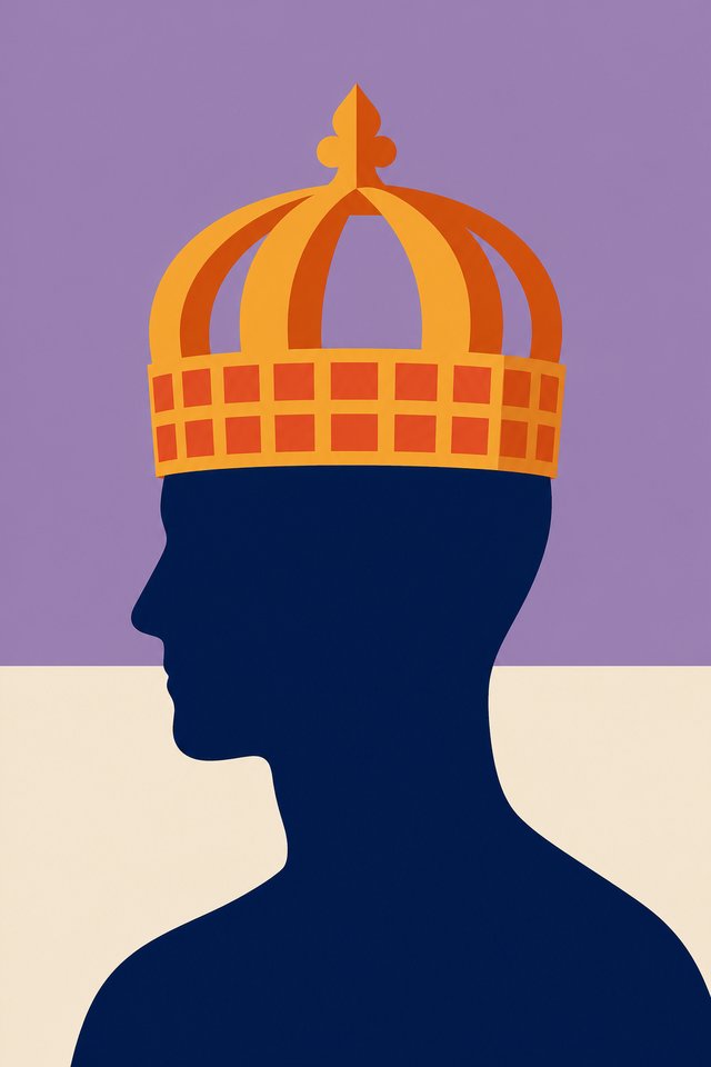
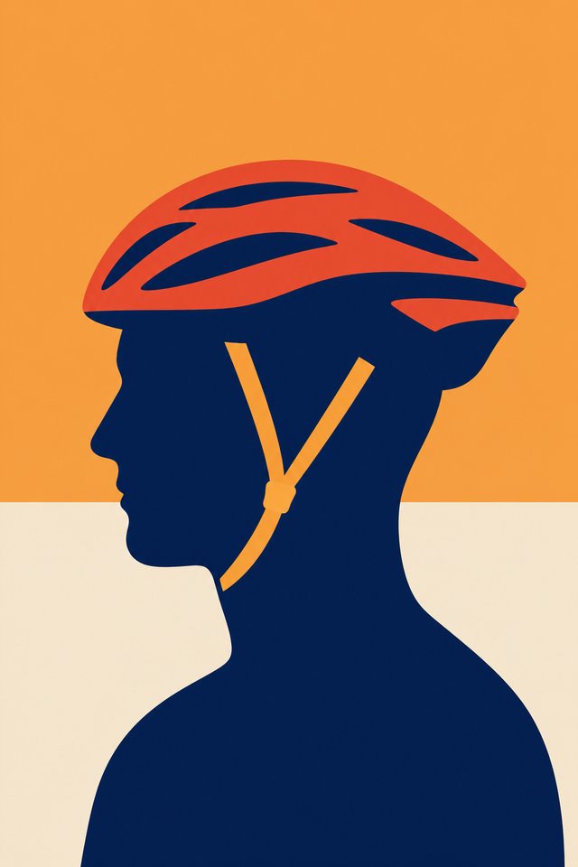
Three flat shapes, crisp edges, no texture, no line. Neutral, and it reproduces at any size.
Everything behind the decision: the vote that picked the style, and everything we tried and did not take. Round two produced six ways to treat the two styles that won the vote; round three took one of those, a colour per card, and tried it five ways. The winner is on the main page. None of this is dead, it is parked, and any of it can be picked back up.
The vote and the feedback that set the direction, moved here off the main page.
Numbered sheets, three identical hats in every row, and no style names anywhere on the image, so nobody was primed by a label. It went to two groups of coaches and facilitators, one German and one English, and onto LinkedIn. Multiple picks allowed. 75 selections came back.
| Style | German group | English group | Total |
|---|---|---|---|
| Flat colours | 13 | 12 | 25 |
| Orange-blue overprint | 13 | 8 | 21 |
| Studio clay | 7 | 6 | 13 |
| Painted object | 4 | 2 | 6 |
| Torn paper | 4 | 1 | 5 |
| Realistic photograph | 5 | 0 | 5 |
The top two are clear of the field. Painted object was our own favourite going in and came fourth, so we dropped it as the lead direction and are carrying flat colours and the overprint forward. Here is what people were actually looking at.
Three flat shapes, crisp edges, no texture, no line. Neutral, and it reproduces at any size.
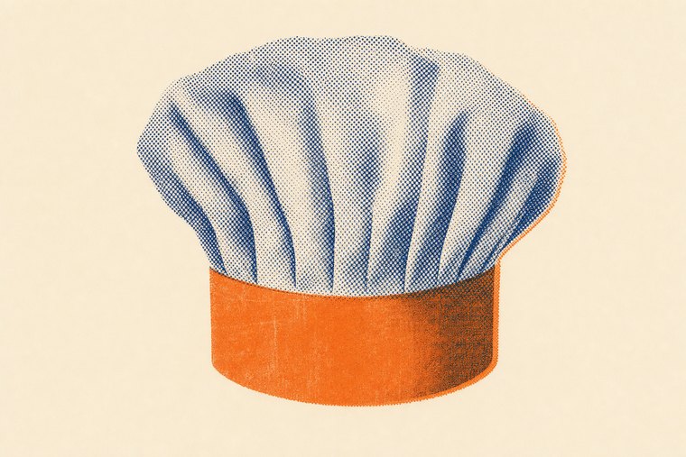
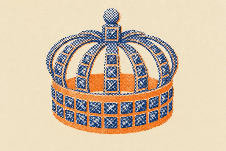
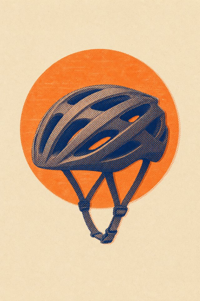
A two-ink risograph print, navy and orange, on cream paper. Coarse halftone, deliberate misregistration. The most character of the nine, and the most demanding to hold steady over 50 cards.
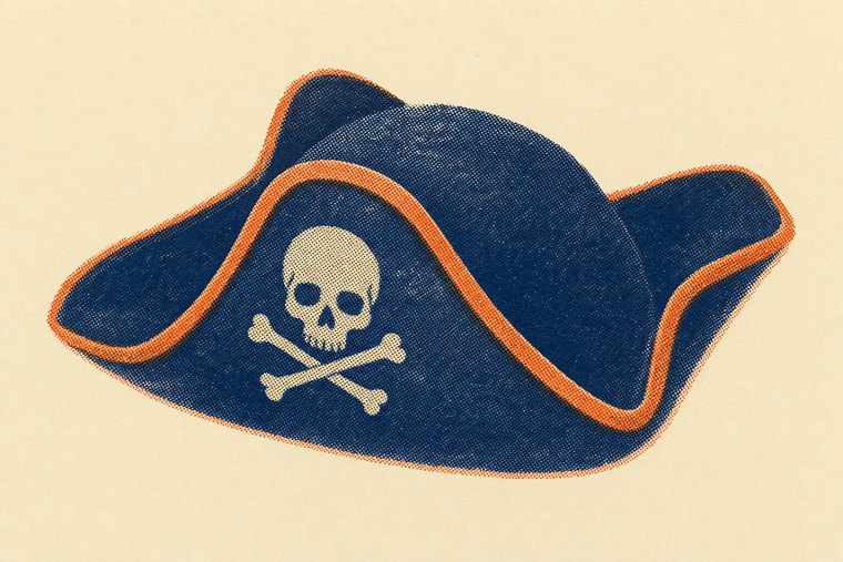
Two things came back from inside metaFox that the poll did not measure.
Artificial images may not be safe for coaching. Two external practitioners told us that when an image is visibly machine-made, people get stuck on the fact that it is fake, and that interferes with what they read into it. In a deck whose whole method is projection, that matters more than which style looks best on a screen.
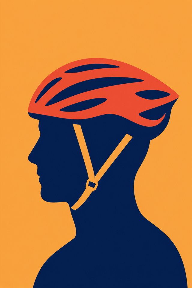
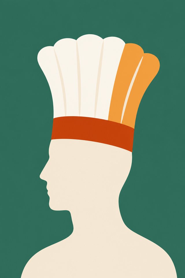
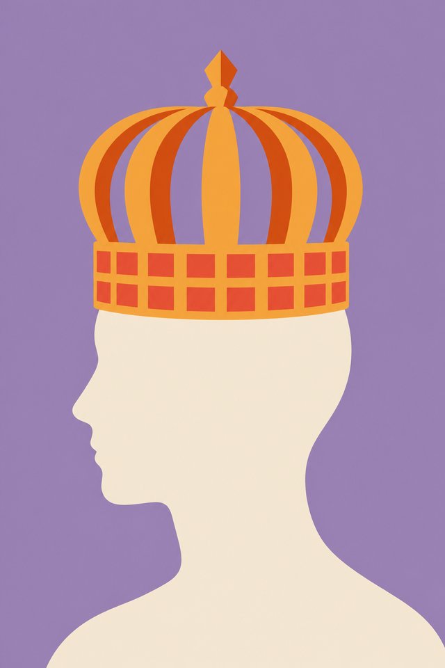
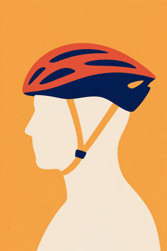
Put a person under the hat. A hat on its own is an object. A hat on a head is a role, and that is what the deck is about.
Realistic photography came last in the public vote and first with our team, so we have not closed that question. We have built a variant that keeps both.
Six ways to treat the two winning styles, three hats each. All of them portrait, which is the shape of the cc card we propose below; the earlier tests were landscape and would have to be cropped on all 50.
One of the six is the direction we are now developing, a colour per card. The other five are parked, with our reasons, on a separate page. None of them is dead.
The winning style on a solid navy head and shoulders. Closest to what we are now developing, but every card looks the same, so the deck has no colour of its own.
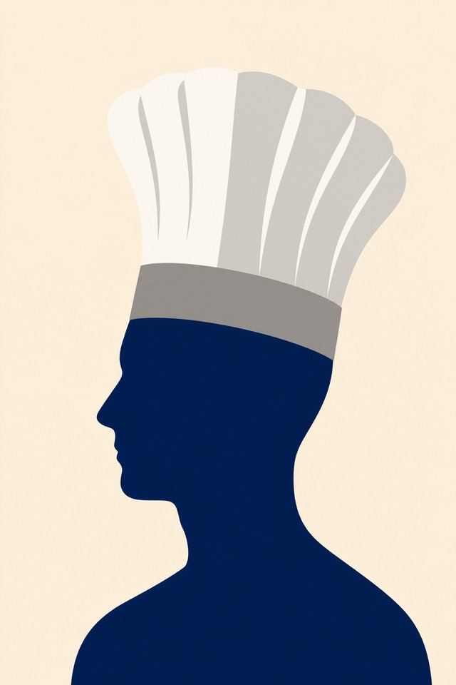
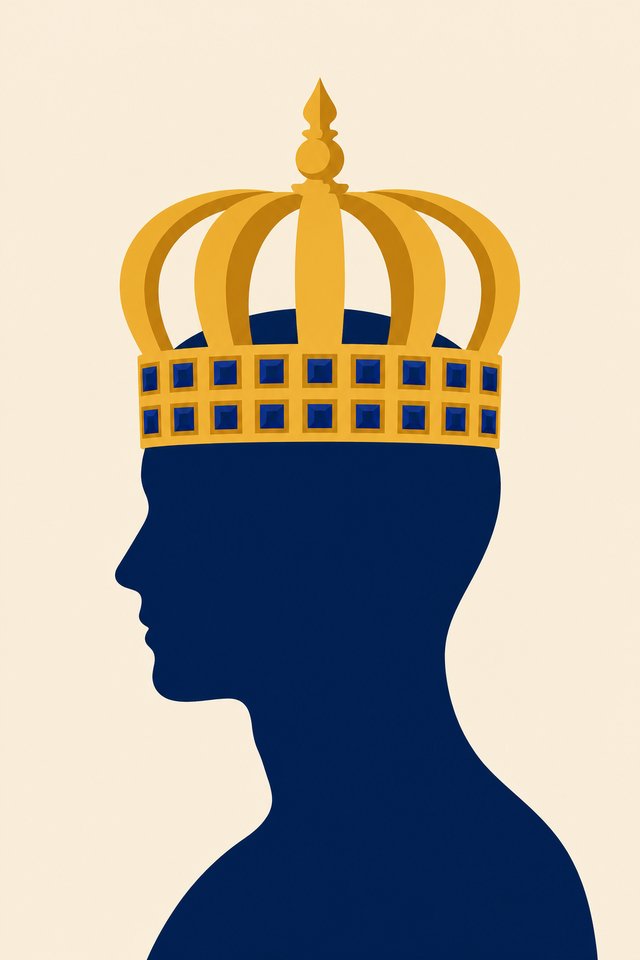
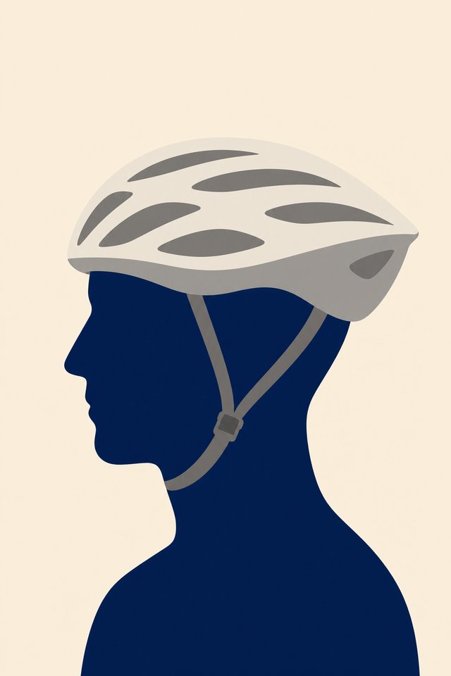
The two-ink risograph print, navy and orange, head as a coarse halftone. The most character of the set. Held back because 50 cards in two inks means every hat has to survive on two colours, and a few of them will not.
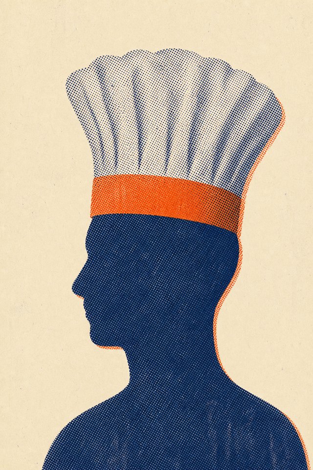
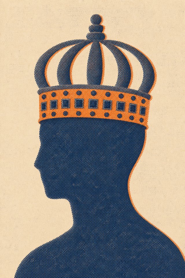
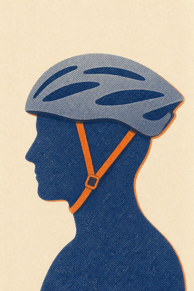
Two inks, hat alone on a solid circle. Bold as a poster. The hat stops being something a person wears, which is the point of the deck.
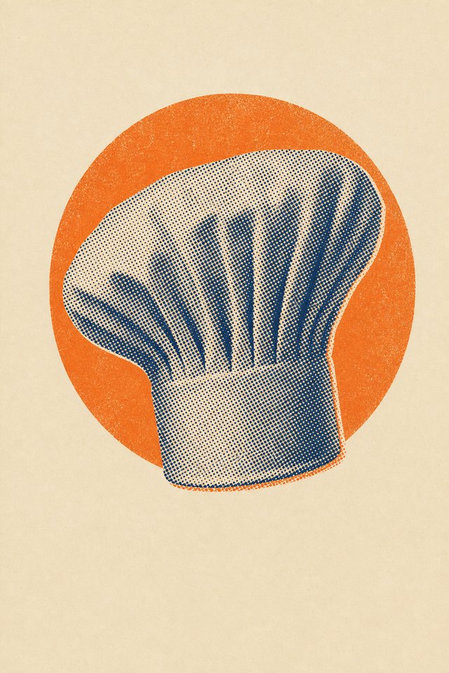
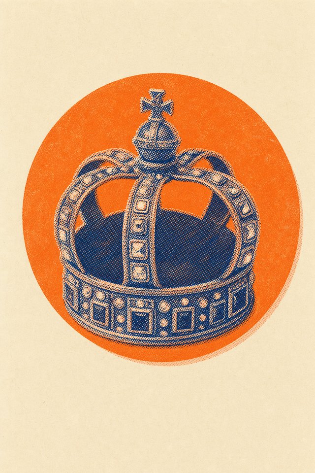
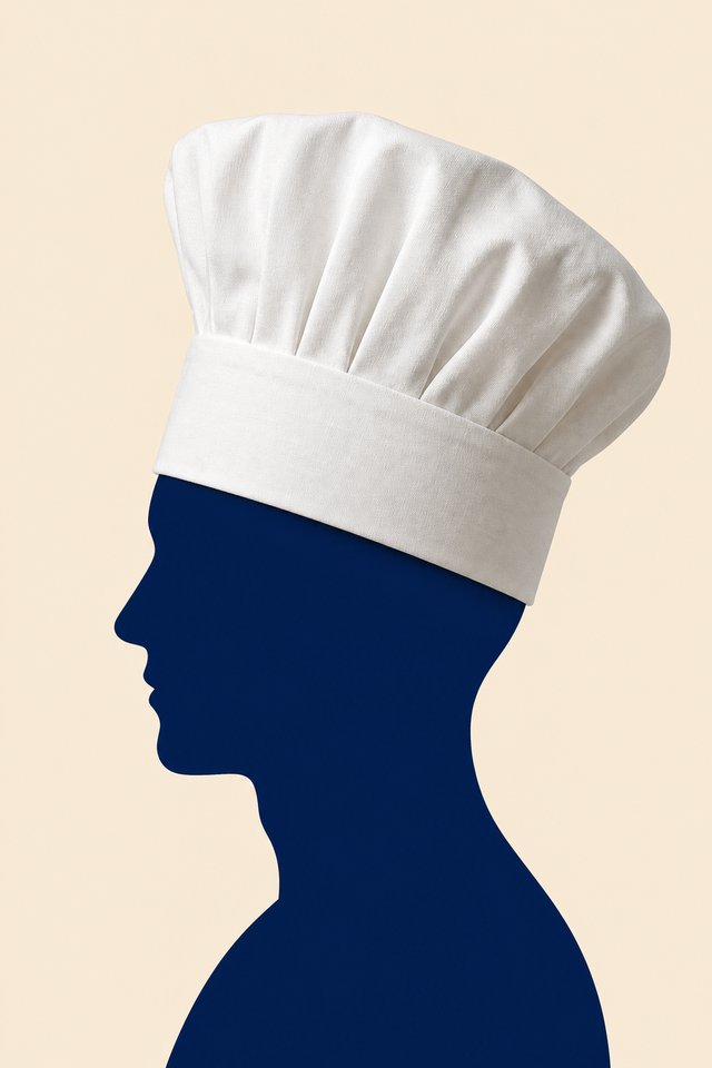
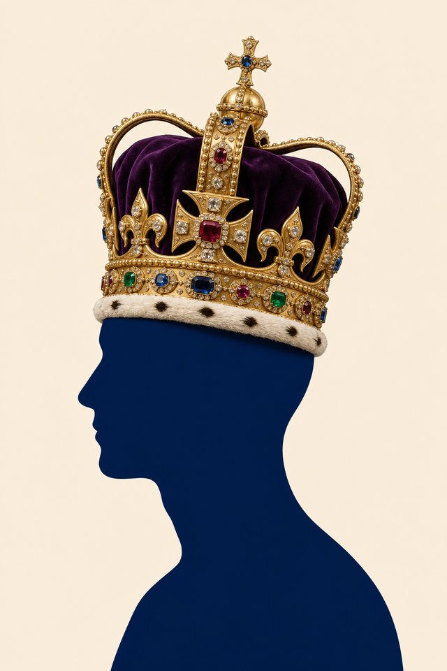
The hat photographed as a real object, the head under it a flat graphic shape. Our answer to the objection that a machine-made picture reads as fake. Still open, and the strongest card here if that objection turns out to matter more than the vote suggested.
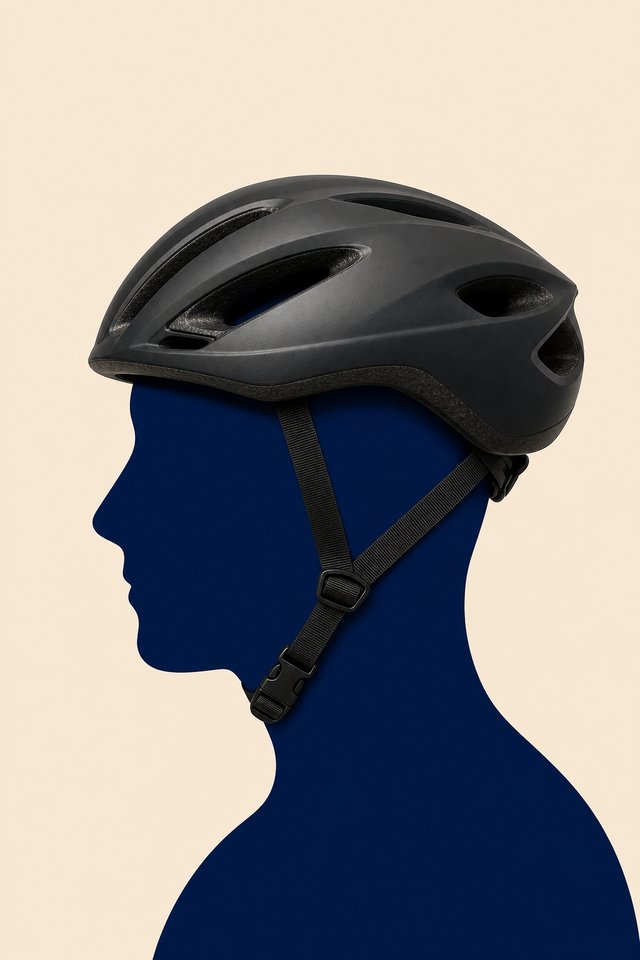
A navy field with the head cut out of it. Strongest across a table at distance. Inverts figure and ground, which suits a deck about what other people put on you.
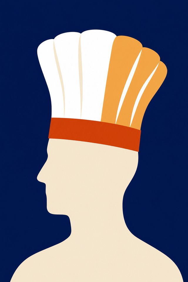
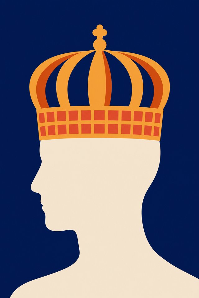
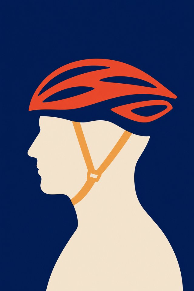
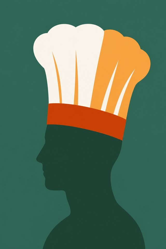
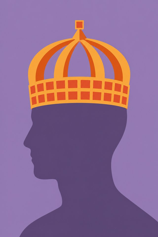
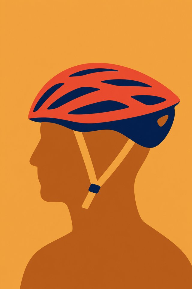
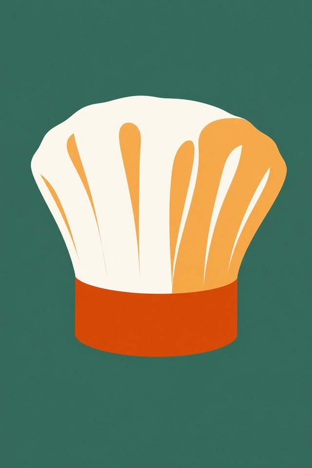
Once the direction was set, five colour treatments were tested, each one with a head under the hat and with the hat on its own. Tonal with the hat on its own won. The other four, and every version with a head, are here.
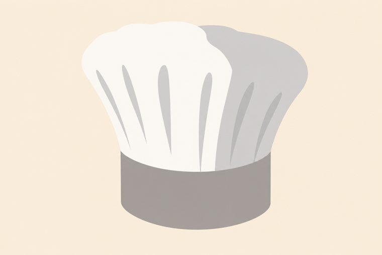
The winner without its head. Same idea, same colours, a deeper tone of the ground under the hat.
With a head
Hat on its own
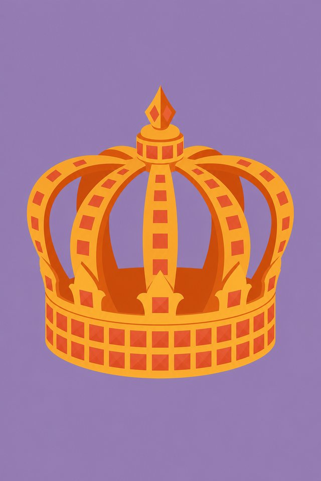
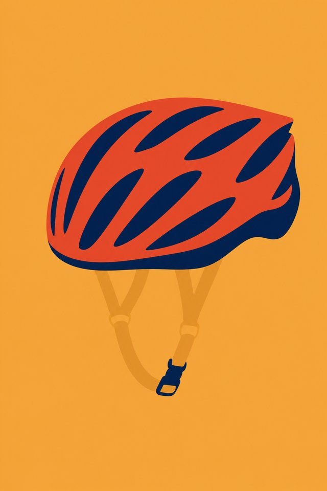
One recognisable person on all 50 cards, only the ground changing. Strong, and it made the deck about that person.
With a head
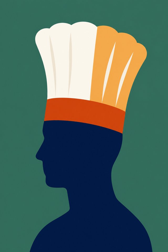
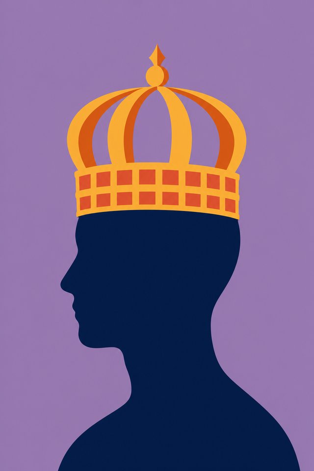
Hat on its own
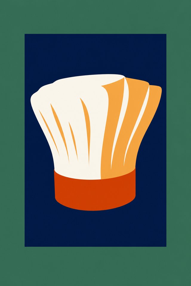
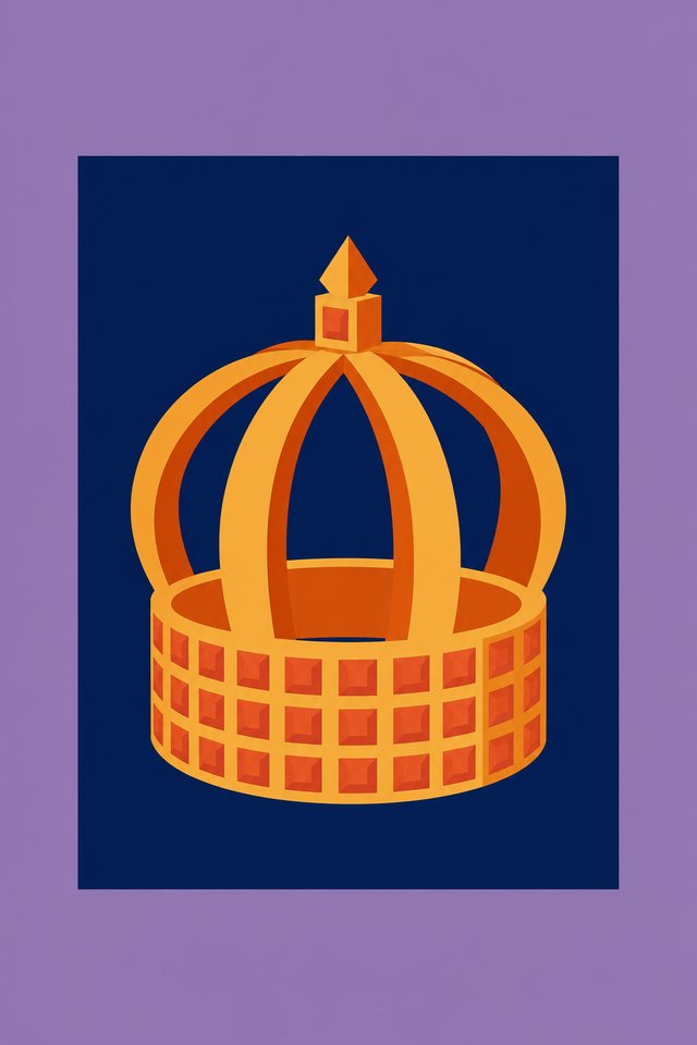
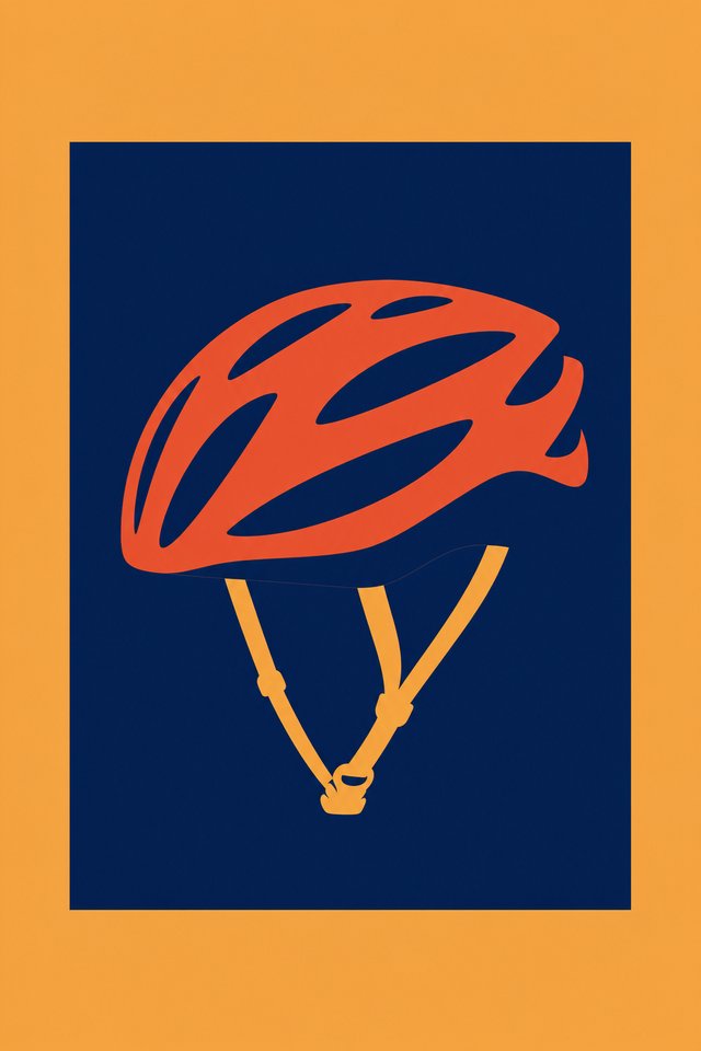
The head as the lightest thing on the card. Friendliest of the five.
With a head
Hat on its own
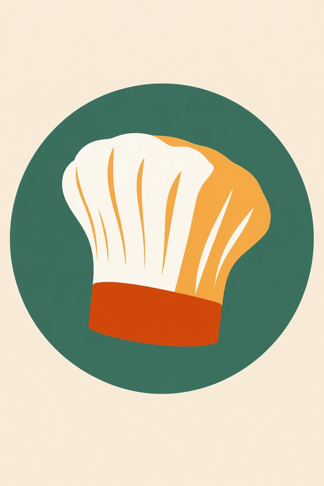
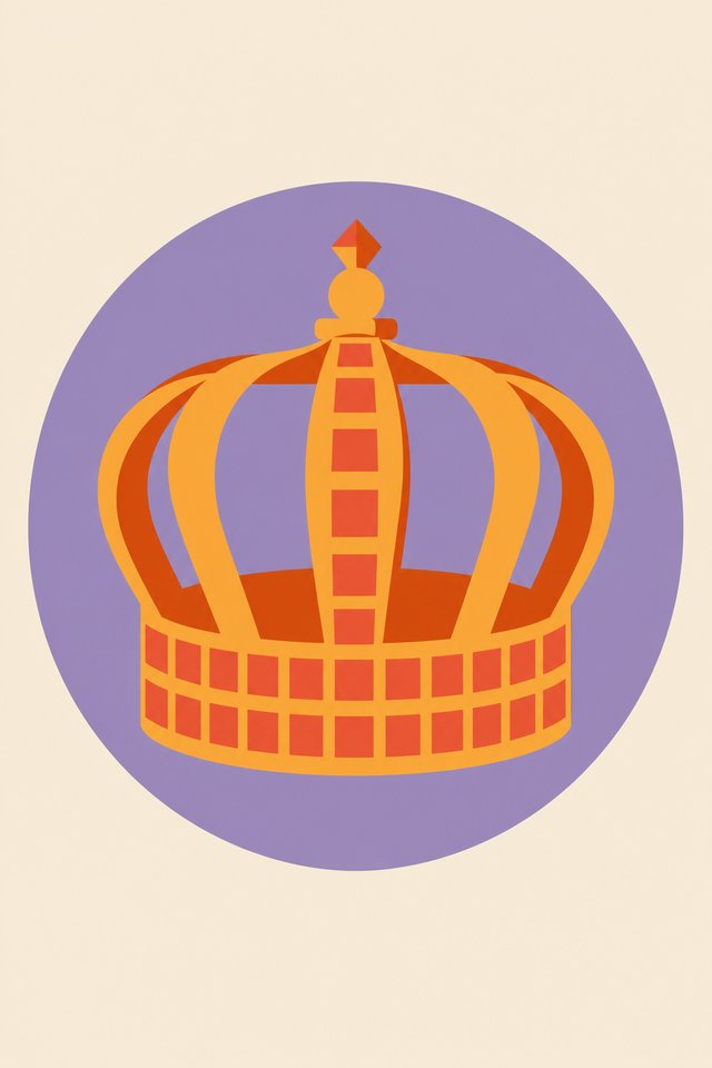
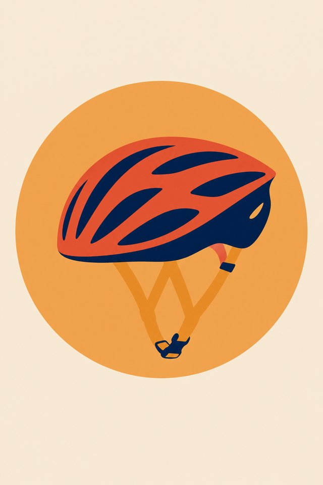
A soft ground with the hat carrying all the contrast. Too quiet next to the others.
With a head
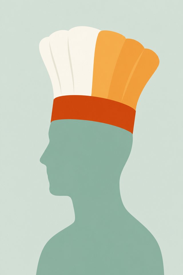
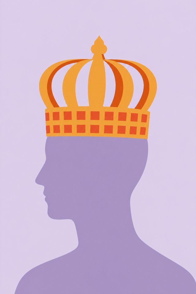
Hat on its own
A colour block over cream with one hard edge, the figure crossing it. Gives a place for a number or a name later, if we ever want one on the face.
With a head
Hat on its own